

Essential Steps for Building a Strong Visual Brand Without a Logo…Yet
“Everything we do communicates.”
One of your first steps as a new nonprofit or business is to build brand awareness, which may or may not include a logo. You might ask why a brand designer would tell you this—but I strongly believe you need to get to know your target audience and organization for the branding process to be effective. In fact, I started my own business without a “logo” and did not rebrand till several years down the road. A logo is the pinnacle of your branding, the shining star at the top of a pyramid that represents, at a glance, all that your brand stands for. In this step-by-step tutorial, I will cover nine ways you can build a strong foundation—the bottom of your pyramid—by using consistency to establish brand recognition.
Jumpstart Your Brand Without a Logo: A Comprehensive Guide
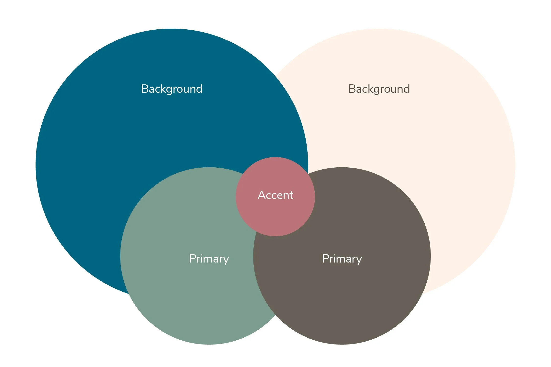
Color
Color communicates energy and emotion to your audience. Choose colors that fit your brand’s personality (bright neon; muted classics; nature colors; dark and moody; etc). If you’d like to learn about color psychology, download my free resource, Learn How Color Can Amplify Your Brand Voice.
Limit your palette to two main colors plus one accent color, and one light and one dark background color. Your background colors should have enough contrast so that you can use them for text (i.e. white text against a black background or dark brown against cream, etc). There are many websites that offer color palette inspiration, such as https://coolors.co/
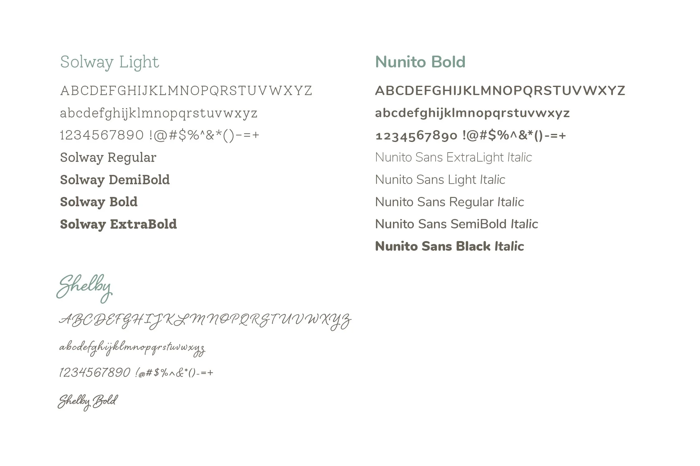
Typography
A typeface can enhance your message—it gives the written word personality. Fonts can be friendly, techy, modern, elegant, or fun-loving. So choose what fits your brand voice. Pick two main typeface families and one accent font (starting to see a pattern?).
My base recommendation is to choose one san serif (like Helvetica) and one serif typeface (like Times New Roman) and an accent font with a bit of personality, used sparingly. There are a lot of font pairing recommendations out there, but one to try is https://www.fontpair.co/ which utilizes free fonts.
Sources for free or low-cost fonts: Google Fonts, Font Squirrel, The League of Movable Type, Lost Type Foundry, and Creative Market.
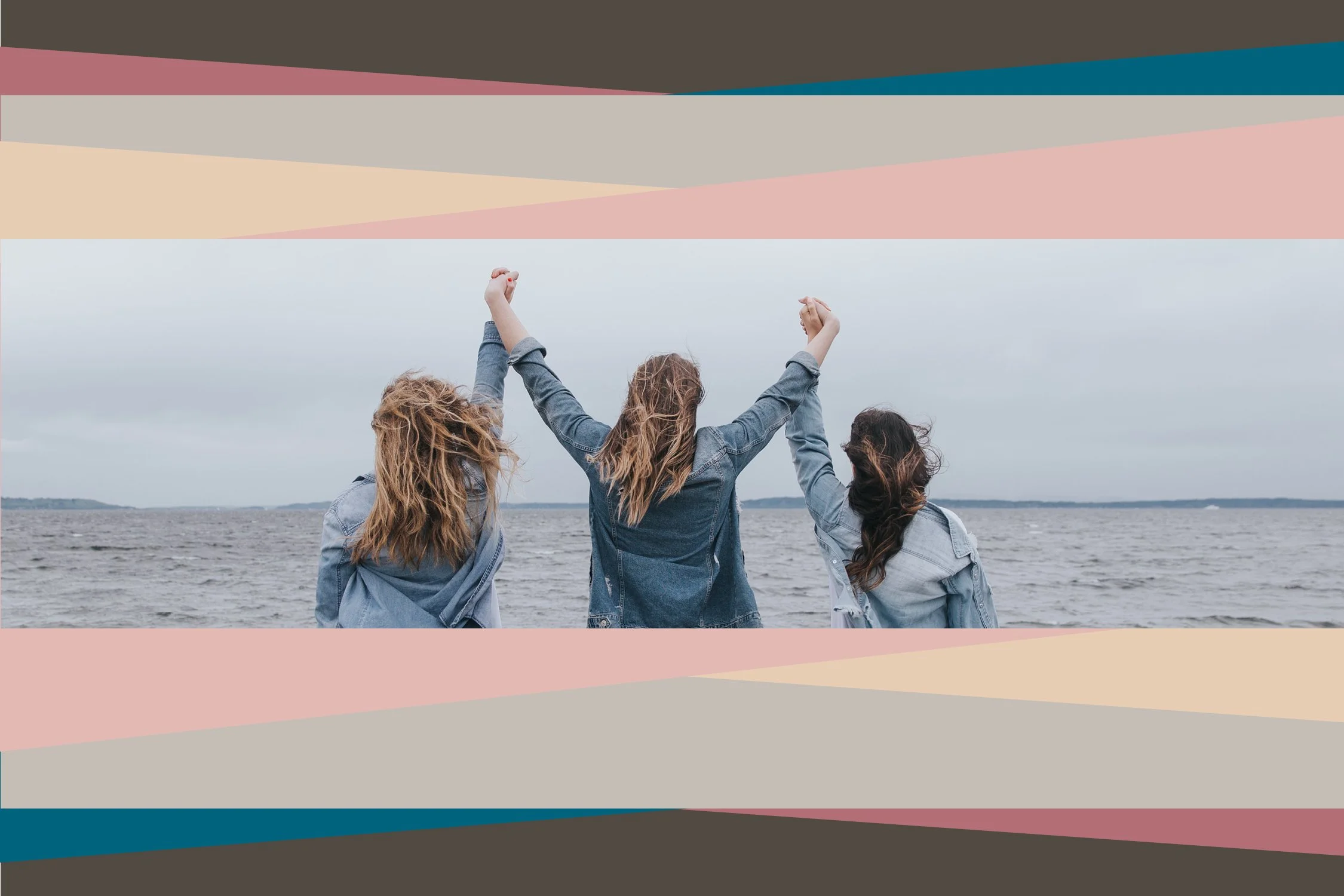
Imagery
Think about the type of images that will resonate with your audience: sporty, conservative, human-centered, fun, quirky, or trendy. Make an adjective list of what makes sense for your brand, and then look for that style of photography or illustration and stick with it. That might mean all black-and-white photos, hand-drawn sketches, abstract images, or photojournalism.
Some sources for free or low-cost imagery: Pexels, Unsplash, Nappy, Rawpixel, Public Domain Image Archive, iStock, Tonal, and Vecteezy.
Sources for icons: Material Design Icons, The Noun Project, Bootstrap Icons, SVGrepo, Iconmonstr, and iStock

Templates
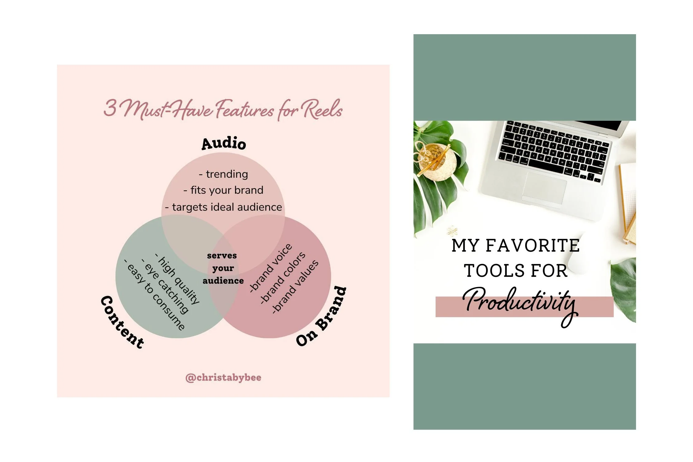
Don’t feel like you have to be a professional designer to have a polished look. One way to make sure you stand out in a crowded social media feed is to utilize design templates. Canva.com is a free resource (and the professional version is free to non-profits!) that includes many templates to choose from. Creative Market offers sets of templates that can be imported into Canva or other programs.
Plug your colors, fonts, and imagery into templates to make them your own. Use the same five or so designs and rotate in new messages and images to keep them fresh.
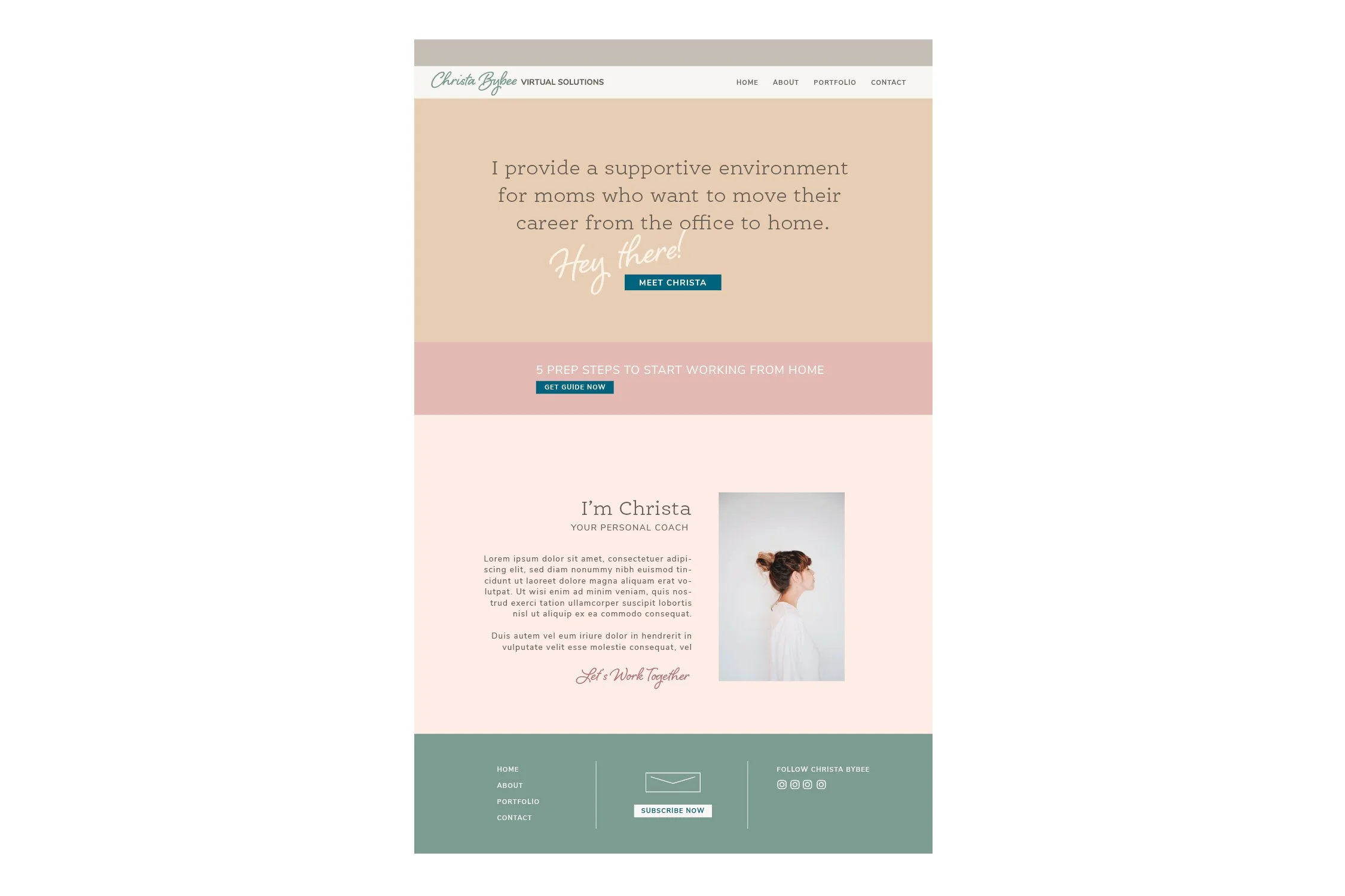
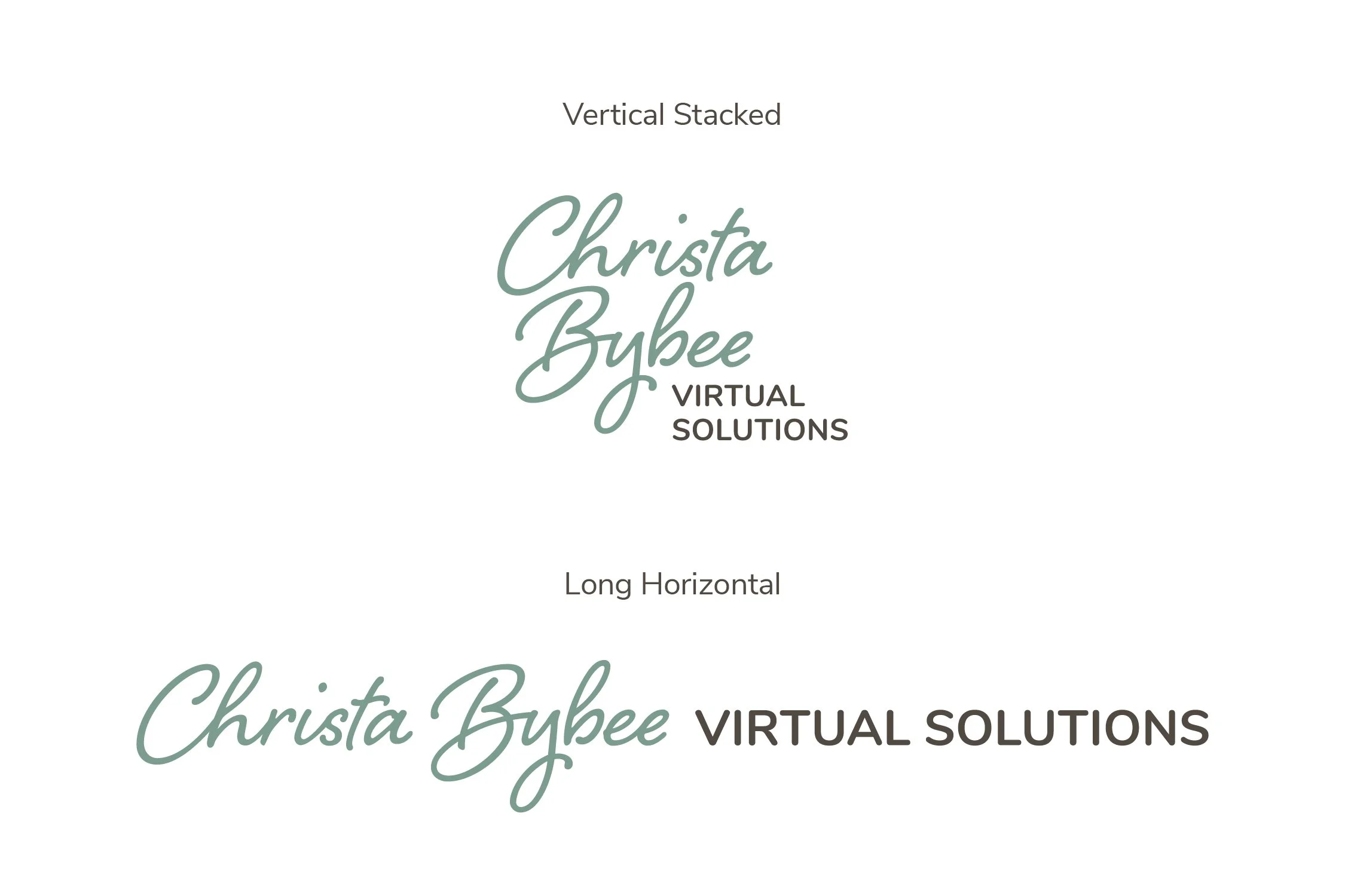
Wordmark
You might wonder how people will identify your business or nonprofit if you don’t have a logo. One way is simply to typeset the name of your organization in one of the brand typefaces you chose earlier. Have two versions of your name—one that will work well horizontally, and one that will work well in square or vertical spaces. At this point, I advise you to stay away from any icons or incorporate any images next to your typeset name, as tempting as that may be.
While Canva templates are great for social media and flyers, they are NOT good for logos. Canva does not allow any of its logo templates to be trademarked, and you run the risk of another organization looking exactly the same as yours.
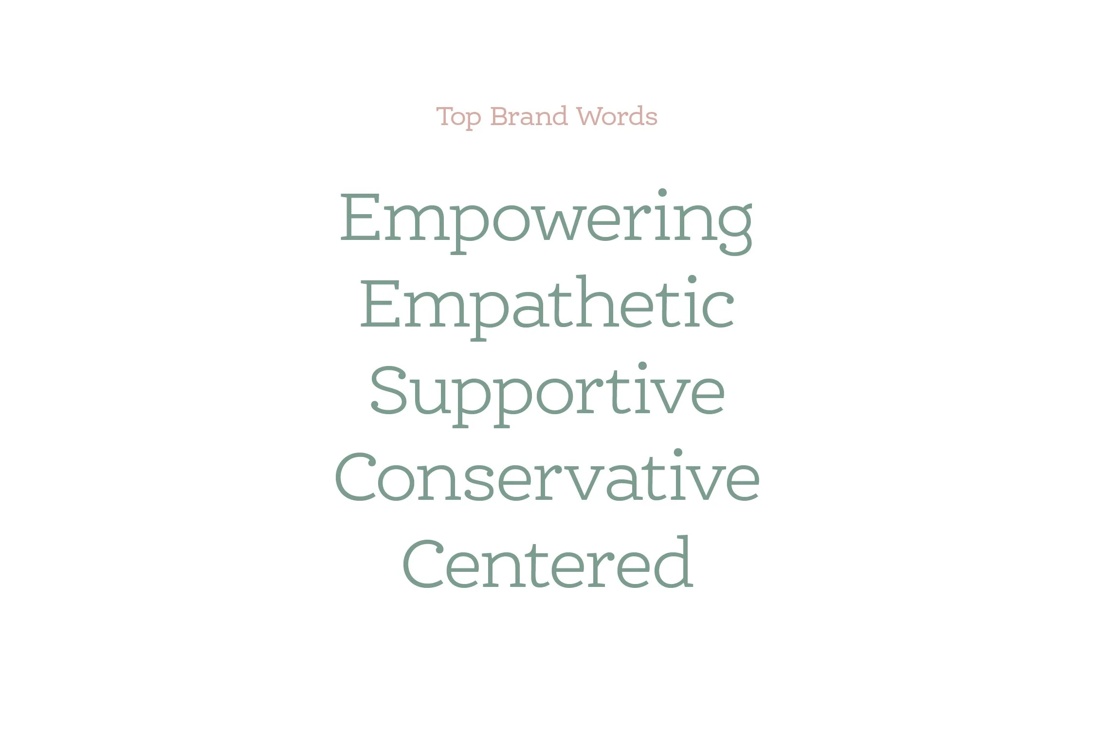
Brand Voice
How you speak to your audience is a pillar of your brand. Merril-Lynch, Fisher-Price, Yale, and Harley-Davidson have very different brand voices. Are you detailed, casual, fun, serious, youthful, rebellious, or caring? Again, a list of adjectives that relate to your brand will help you to figure out the best tone of voice to use when speaking to your audience.
Design Tips
Design hierarchy is key to getting your message across visually. Choose no more than three sizes of type with contrast between each (either through size, boldness, or all caps vs. not).
Digital designs (social media, web ads) should use type 24 pt or larger, with no type smaller than 14 pt. A comfortable size for printed body copy is 9–11 pt type, with headings in the 14–36 pt. range. White space gives the eye a place to rest—overload a design with too much information and the eye will not know where to focus.
Stay Consistent
The truth is, you will get bored of your branding before your audience does. As tempting as it may be to “change it up” keep the course for a minimum of six months to a year. Your audience needs to see the same message, delivered in almost the same way, at least 7–10 times before it registers. Use this time to see what messages/visuals/channels resonate with them, and then double down on what works.
When Do You Need a Logo?
You may be surprised how differently you feel about your brand after a year. When you have plateaued in audience numbers/awareness/profit it is time to reevaluate your branding. Once you have a better idea of who your audience is and what your brand stands for, then a professional such as myself can help you dig deeper to identify the values that will expand your reach. Using your brand values as a base, we can then uplevel your brand visually with a new logo and design framework.
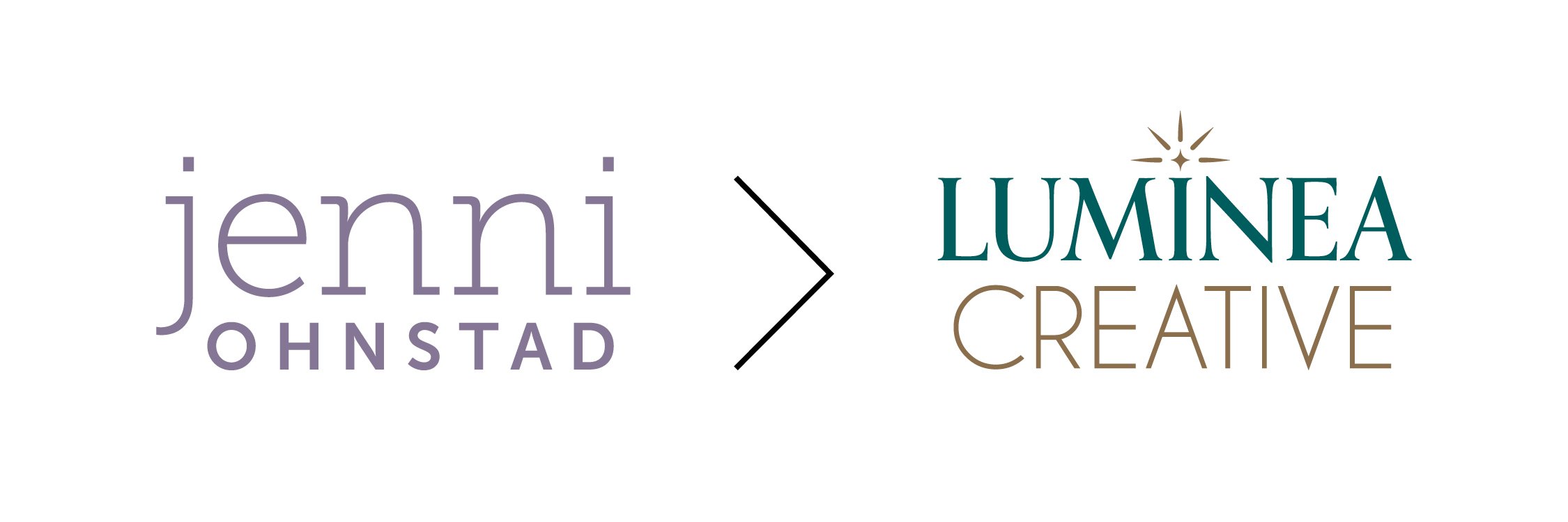
My own evolution from a simple personal wordmark to a more polished logo that better reflects my business and values.
Closing Thoughts
While some people know the who, how, what, and why behind their brand right out of the starting gate, many more of us only have a fuzzy idea of which direction we want to go. Whether it is due to budgetary reasons or uncertainty, sometimes you have to let a brand develop a bit before committing a logo and tagline to it.
But no logo does not equal no branding! By taking the time to choose a suite of consistent visual elements, such as color, type, imagery, templates, and brand voice, you are creating brand awareness. Once you have an audience interacting with your brand, you get a better idea of what resonates with them, helping you to narrow your focus.
One negative of going this route is that being your own designer will not save you time, and in fact, may lead you down a Pinterest/Google wormhole. This guide is meant to get you started when you still feel a bit unsure about which direction you need to go. When you are ready to leave DIY behind and want a professional, polished look, I can partner with you to uplevel your branding. Together, we will uncover the values that will amplify your visual voice and connect to your audience on a deep, emotional level through strong branding.
My Two-Week Brand Intensive is perfect for new nonprofits and consultants ready to leave DIY behind. Contact me here.
